> ## Documentation Index
> Fetch the complete documentation index at: https://docs.uselooop.com/llms.txt
> Use this file to discover all available pages before exploring further.
# Radio
> Show product options to the user
The product options element shows a set of options available for the parent product card. When the user selects the options, Looop updates the price, the compare price, and the hero picture.
You can design product options using a [dropdown](/webflow/productcard/options/dropdown) or [radio](/webflow/productcard/options/radio) button.
## Setup
We will create a template for product options. This template will be used to create product options for each product card.
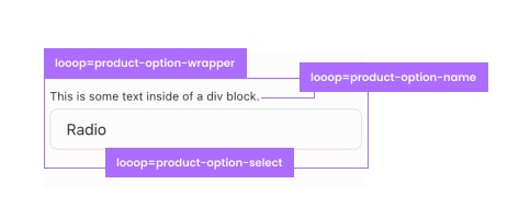 1. Create a div block and give it the following Attribute:
```html theme={null}
looop=product-option-wrapper
```
2. Inside the div block, create a text block and give it the following Attribute:
```html theme={null}
looop=product-option-name
```
3.. Inside the div block, create a radio element and give it the following Attribute:
```html theme={null}
looop=product-option-select
```
## Checked State
1. Create a div block and give it the following Attribute:
```html theme={null}
looop=product-option-wrapper
```
2. Inside the div block, create a text block and give it the following Attribute:
```html theme={null}
looop=product-option-name
```
3.. Inside the div block, create a radio element and give it the following Attribute:
```html theme={null}
looop=product-option-select
```
## Checked State
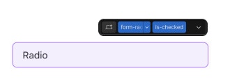 When the product option is selected, the radio button should be checked. To do this, we will add a combo class of `is-checked` to the radio button.
You can use this class to design how your checked radio buttons look.
## Color Swatch
Radio buttons can be used to show color swatches. To do this, we will add a background color to the radio button.
We need to add following custom attributes to the radio button:
```html theme={null}
lp-is-color=true
```
Add the following custom attribute to the options wrapper:
```html theme={null}
lp-options-set=Color
```
Change the value of `lp-options-set` to the name of the option set.
As long as your color options names are simple colors like Black, white, Red, Blue etc. this will work. However, if you are using custom color names like Space Grey, Phntom Black, Plum Purple etc you need to use [LooopConfig](/integrations/looop-config).
## Custom Colors config
Add custom color to [LooopConfig](/integrations/looop-config) in the following format:
```html theme={null}
```
## What will be updated?
On page load for each Shopify product option, we will duplicate the `product-option-wrapper` for each option set, duplicate `product-option-select` for each value of each option set, and update the `product-option-name` with the product option name.
Option Radio buttons element should be inside a Webflow Form element.
When the product option is selected, the radio button should be checked. To do this, we will add a combo class of `is-checked` to the radio button.
You can use this class to design how your checked radio buttons look.
## Color Swatch
Radio buttons can be used to show color swatches. To do this, we will add a background color to the radio button.
We need to add following custom attributes to the radio button:
```html theme={null}
lp-is-color=true
```
Add the following custom attribute to the options wrapper:
```html theme={null}
lp-options-set=Color
```
Change the value of `lp-options-set` to the name of the option set.
As long as your color options names are simple colors like Black, white, Red, Blue etc. this will work. However, if you are using custom color names like Space Grey, Phntom Black, Plum Purple etc you need to use [LooopConfig](/integrations/looop-config).
## Custom Colors config
Add custom color to [LooopConfig](/integrations/looop-config) in the following format:
```html theme={null}
```
## What will be updated?
On page load for each Shopify product option, we will duplicate the `product-option-wrapper` for each option set, duplicate `product-option-select` for each value of each option set, and update the `product-option-name` with the product option name.
Option Radio buttons element should be inside a Webflow Form element.